Black and grey or full color is the first real fork in a tattoo consultation, and it is a fork with consequences: the two approaches age differently, read differently at a distance, suit different subjects, and ask different things of your skin and your habits. Neither is the serious choice or the fun choice. They are different tools, and the right answer depends on the subject, your skin tone, and how the piece will live outdoors in North Carolina summers.
Many strong pieces use both: black structure and grey shading carrying the form, with color reserved for the elements that need it. But when a design leans fully one way, here is the honest comparison artists walk clients through.
How each one reads
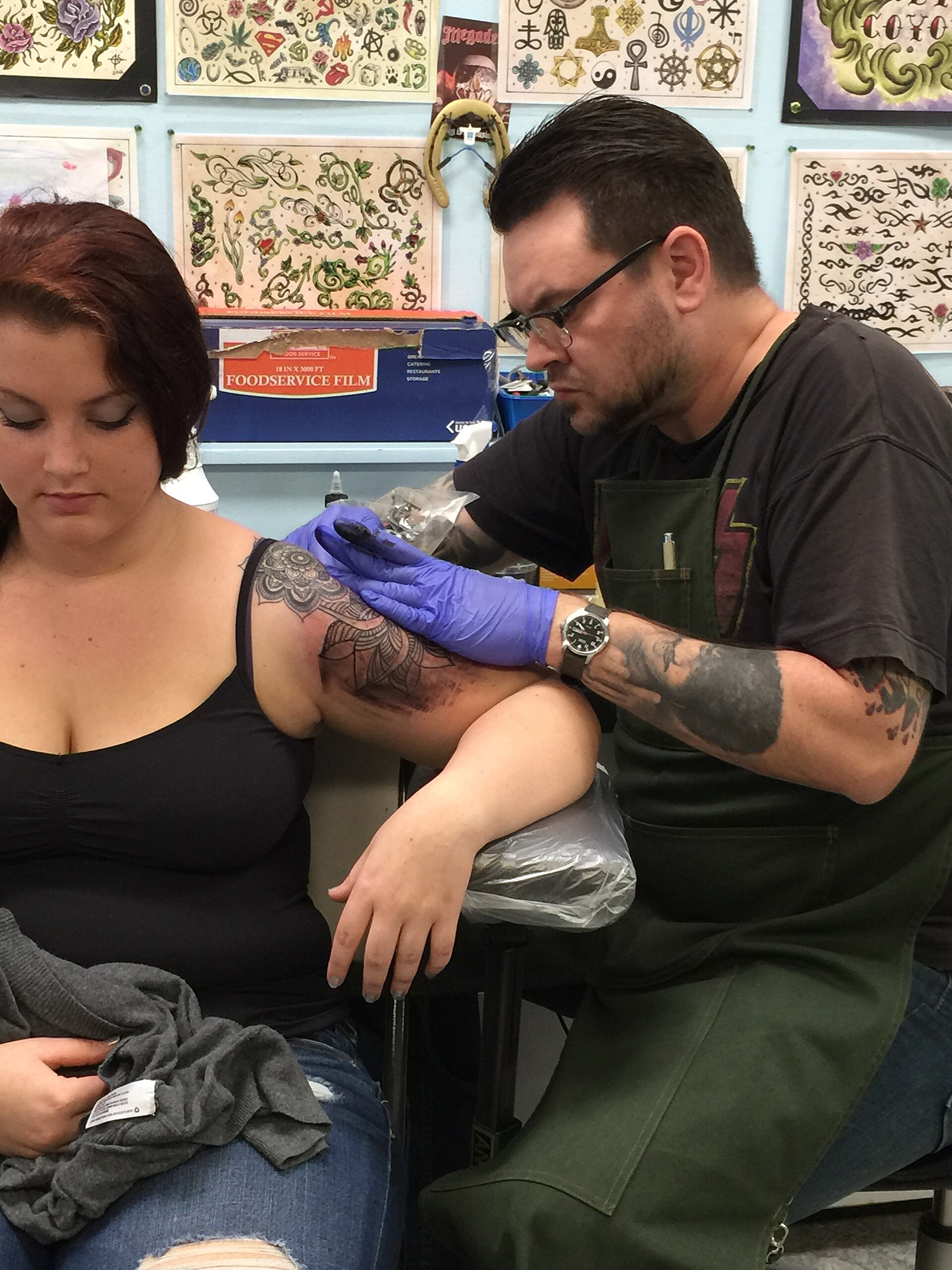
Black and grey work is built entirely from value: solid black, and greys made by diluting black ink or by stippling and whip shading. Because it relies on contrast rather than hue, it tends to read clearly from across the room and in photographs. Portraits, religious imagery, memorial pieces and anything meant to feel somber or photographic usually live here.
Color work reads through hue as much as contrast. A traditional piece with bold red, green and gold announces itself instantly and carries a cheerful, graphic energy black and grey cannot fake. Color can also separate overlapping elements that would tangle in grey: a snake through flowers is easier to parse when the snake is green and the flowers are red.
How each one ages
Black pigment is the most stable thing in tattooing, so a black and grey piece has a long, graceful aging curve: it softens, the lightest greys lighten further, and the piece gradually becomes a lower-contrast version of itself. Artists compensate by pushing the darks darker than looks necessary on day one.
Color ages by fading unevenly. Yellows and light reds retreat first, especially with sun exposure, while blues and greens hold. A color piece at year ten often looks like itself with the warm end of the palette turned down. Sunscreen on healed tattoos is the single biggest variable, bigger than ink brand or skin type. A color tattoo on a Charlotte client who works outdoors needs that conversation up front, and sometimes a design adjustment toward bolder, deeper color.
Skin tone and subject fit
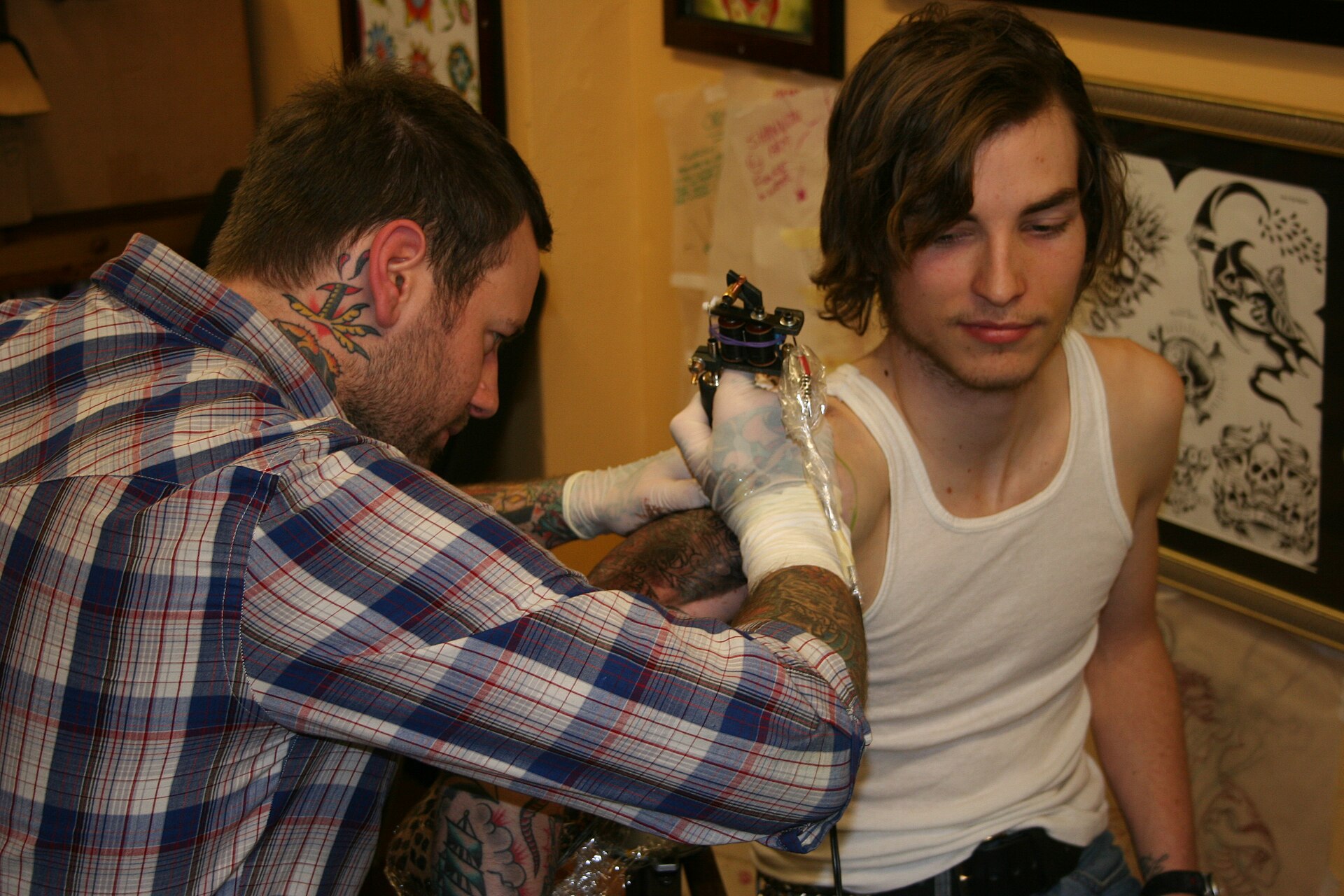
Skin is a tinted window over the ink. On deep skin tones, light colors and fine grey gradients lose contrast, while strong black work and saturated jewel tones hold their presence. On very fair skin, delicate grey shading shows beautifully and pale color stays visible longer. None of this limits anyone to one style; it changes the recipe. A good artist adjusts value ranges and color choices to the canvas in front of them and will show healed examples on similar skin.
| Question | Black and grey | Full color |
|---|---|---|
| Best subjects | Portraits, memorials, realism | Traditional, Japanese, illustrative |
| Distance reading | Strong, through contrast | Strong, through hue and contrast |
| Aging pattern | Softens evenly, light greys fade first | Warm colors fade first, blues and greens hold |
| Sun sensitivity | Moderate | Higher, sunscreen matters most |
| Touch-up needs | Occasional contrast refresh | Color refresh sooner in sunny climates |
Making the call
Choose by subject first, skin second, lifestyle third. If the piece is a portrait of your grandfather, the conversation is already over. If it is a koi sleeve, color is probably the point. Where clients get stuck is the middle: illustrative pieces that work either way. There, the deciding question is how you live. Outdoor job, lake summers, no patience for sunscreen: black and grey will forgive you more. Mostly indoors and happy to maintain: color will pay you back every time you look at it.
Common questions
Can a black and grey tattoo be colored in later?
Often, yes. Color can be added over healed black and grey work, and some clients plan it that way in stages. The reverse is much harder: covering color with black and grey usually means going very dark. If you are torn, starting with black and grey keeps the color door open.
Which hurts more, black and grey or color?
The outlining feels the same. Color packing and grey shading both involve repeated passes over an area, so larger saturated pieces of either kind feel similar by the end of a session. Sitting length and placement matter far more than the palette.
Which style is better for dark skin?
Strong black work and bold, saturated color both hold up well on deep skin. Very light greys and pale colors lose contrast. An experienced artist will adjust the design's values for your skin and should be able to show healed work on similar skin tones.
Photos in this guide are representative stock images.
← All guides from Blaq Lyte Tattoos presents: Defense Tattoos← Back to Blaq Lyte Tattoos presents: Defense Tattoos